Renovate America App
Launching a digital application and calculator to scale Benji financing.
When: Fall, 2016
For: Renovate America
Role: UI design. Some UX design in the calculator and application.
Opportunity
Renovate America was ready to scale their new unsecured financing product, Benji. At the time, Benji operated as a lean startup and only accepted applications over the phone. The business identified the need for a new digital channel for accepting applications in order to scale the product while reducing operational overhead. I became a dedicated resource to the Benji team to lead the user interface design for the RA mobile app.
Product Overview
Application Flow
Start an Application
Locate the Home with GPS
Auto-fill Address Form
Project Type Selection
Homeowner Info
Application Result
Calculator
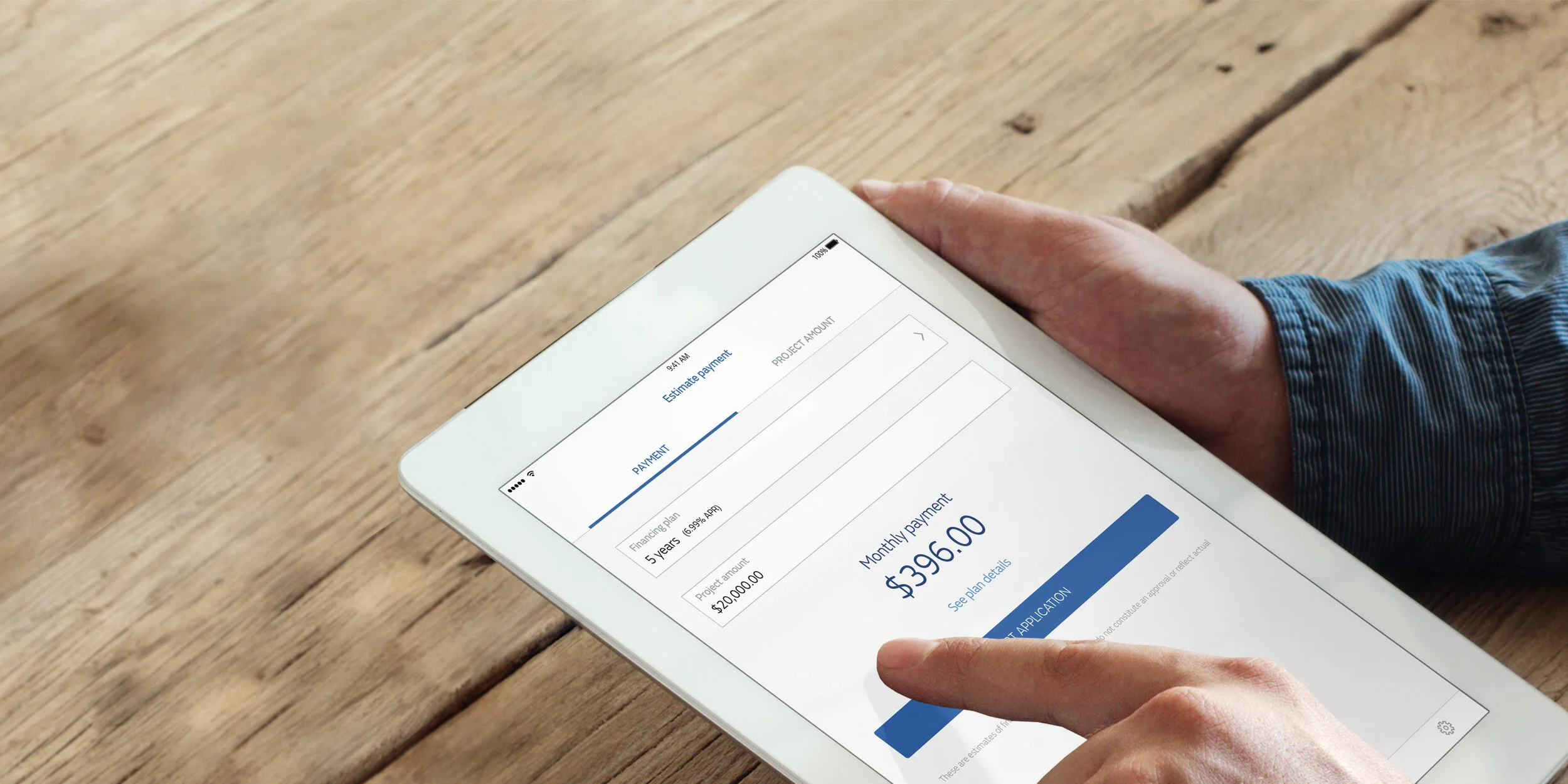
Calculate a Payment
Calculate a Project Amount
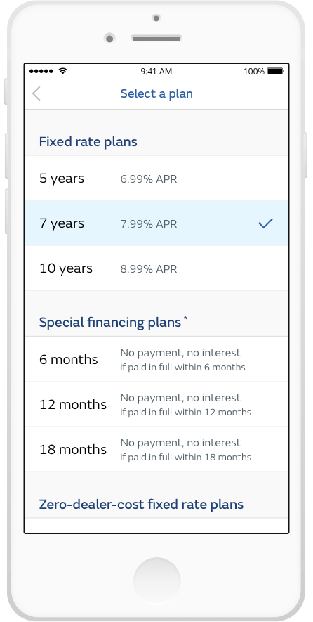
Plan Menu
Process
Getting Started
Before pushing any pixels, I setup time with different departments to learn more about the project.
User Experience
Q: Who are our customers?
A: The customers using the mobile app break down into two groups:
Contractor (CO) - The person doing the home renovation work who has partnered with RA to offer their customer a financing option to pay for the work.
Property Owner (PO) - The person renovating their home who wants to finance the cost of the renovation.
Product Management
Q: Who are the primary stakeholders and what are their goals for the app?
A: I partnered with product management to identify and meet with key stakeholders. In doing so, I was able to get a better sense of each departments goals for the app:
Sales - Increase Benji application volume
Compliance - Avoid in-app fraud risks with shady contractors filling out homeowner info
Operations - Ensure customer's using the app have access to their application ID number in case they call in to resume an application or want to increase their approval amount
Legal - EULA acknowledgment, application acknowledgments, and other disclosures
Technology
Q: How is the app being built?
A: The tech team decided to build a hybrid app using the Ionic framework so that one code base could be used for both iOS and Android versions and ultimately be re-used for a web application.
In short, by setting up meetings with different departments early on, I was able to reaffirm my understanding of our customer's needs, wants, and pains, and learned more about the dual-user experience within the app (some screens are intended for both CO and PO and some screens are only for one or the other). I discovered what was important for each area of the business and that the app was going to be a hybrid build leveraging the Ionic framework.
Creating a Design System
To better serve our diverse range of customers, I began to identify a theme for the visual design that centered around the following words:
Accessibility
The visual design must accommodate tech-novice users and users with difficulty seeing. The font size used on screen and in components, and the contrast level of fonts and components need to comply with the Web Content Accessibility Guidelines rating of AA.
Simplicity
The product should never feel overwhelming. The information on screen must be well parsed to reduce cognitive load. Screens with multiple elements need a clear hierarchy and structure to retain clarity.
Intuitive
Each screen should provide a clear intent and be easy to follow without the need for instructions or coach marks. Design patterns should mimic standard conventions to be familiar to as many users as possible.
Problem
Ionic Inputs
At the time of development, Ionic 3 was out and offered three different types of inputs. I needed to select one input type to use for the app. This was an important decision since the majority of the user’s information was going to be captured with these inputs. Unfortunately, each input type had more BAD than GOOD features as shown below:
Fixed Labels
GOOD
Labels are persistent
BAD
The touch target is unclear - the input's target is actually to the right of the label. Selecting the label will not select the input.
Input doesn’t accommodate long labels
No hint text
No error state
Stacked Labels
GOOD
Labels are persistent
BAD
The touch target is unclear - the input doesn't have a perimeter outline to indicate the touchable area of the input.
Input doesn’t accommodate long labels
No hint text
No error state
Float Labels
GOOD
Labels are persistent
Default labels accommodate large font size and length
BAD
The touch target is unclear - the input doesn't have a perimeter outline to indicate the touchable area of the input.
Input doesn’t accommodate long labels
No hint text
No error state
The float label input was the best starting option because it allowed for large labels and lengthy labels like 'Social Security number' and 'Monthly household income' on small device viewports. However, the input lacked a clear touch target, hint text, and an error state. I began to design custom features for the input to make it more user-friendly.
Solution
01. Input Customization
Here is how I customized the out-of-the-box Ionic float labels to be more user friendly and on brand.
"Normal" State
The input has a large easy-to-see label and a clear rectangular touch target.
"Selected" State w/ Hint
The input’s stroke and title turn blue to visually indicate the selected state and to stand out from other inputs while nested in a form. The hint is a soft gray color that is still legible yet contrasts well from the darker blue label.
"Selected" State while Inputting
The user’s information is formatted while being entered and replaces the hint text. This method of entry keeps the hint in view while inputting to reduce cognitive and aid in completeness.
"Filled" State
A clear contrast exists between the input’s label and the user’s info. Font size, color, and spacing are all working together to create a clear hierarchy.
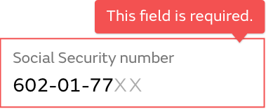
"Error" State
The input’s red stroke and warning icon indicate that the input was not filled in completely. Unlike inline error messaging, the popover error message provides guidance to the user without disrupting the vertical position of elements on the screen.
02. Formatting User Input
I specified hint text and formatting on select inputs to aid in capturing complete and accurate customer information.
Birthdate
If the user inputs a single digit between 1-9 to start with, a “0” will auto populate in the first digit position. For example: If I select the input and type “4”, then “04” will appear to auto-format for the month of April. The slash mark “/” appears automatically after ever two digit set to maintain the formatting structure.
Monthly household income
A comma “,” appears after three digits have been entered to aid the user in inputting the correct amount. The comma is especially useful when amounts have many zeros.
Social Security number
After three digits are entered, a dash “–” appears automatically to maintain common SSn formatting structure. The hint text remains visible as the user types to reduce cognitive load. I worked with development to ensure that alphabetical characters and special characters could be entered into the input.
Phone number
Once a digit is entered a parenthesis “(“ appears in the darker input color to format the area code. The dash “–” appears automatically after six digits are entered.
03. Design System
I themed every part of the mobile app to exude the Renovate America brand and Benji product line. I worked with the FS Emeric typeface, brand colors, and brand iconography to create themed components for the mobile app.
Outcome
The mobile app exceeded all first year goals for application volume.
We piloted the mobile app for a month with several companies and sales reps before publicly launching the app on January 16, 2017 (the web version launched in March). By December 2017, web and mobile channels combined, consistently drove 60% of the incoming Benji applications and have resulted in over $55 million in funded loans.
4.7 stars after one year with 84 reviews.
Easy to use!
“Easy to use and really quick response. Functionality is fantastic. Easy for customers to follow and definitely increases the professionalism of the in home sales experience. Thank you!!”
— Dseay89, 2/10/2017


